---
title: "Flutter Card Widget: Enhance Your App’s UI with Elegant Designs"
url: "https://www.spaceo.ca/mobile-app/flutter/card-widget/"
date: "2026-05-13T05:53:23-07:00"
modified: "2026-06-11T05:23:51-07:00"
type: "WebPage"
resource: "https://www.spaceo.ca/mobile-app/flutter/card-widget/"
timestamp: "2026-06-11T05:23:51-07:00"
author:
name: "Rakesh Patel"
word_count: 1909
reading_time: "10 min read"
summary: "Key Takeaways:"
description: "In this post, learn about the Flutter Card widget and how to create it to design a stunning UI for your mobile app. Best 3 Flutter card examples - included."
keywords: "Flutter Card Widget"
language: "en"
schema_type: "WebPage"
---
# Flutter Card Widget: Enhance Your App’s UI with Elegant Designs
_Published: May 13, 2026_
_Author: Rakesh Patel_
**Key Takeaways:**
- Flutter Card is a pre-built widget that provides a material design-styled card to display content in a structured and visually appealing way.
- If you want to know how to create a Flutter card, check the step-by-step process written in this blog.
- **Flutter Card widget** properties include colour, elevation, shape, margin, child, border, and semanticContainer. So you can make customization of your app’s UI.
Read this blog if
1. You are new to Flutter development and looking to know about Flutter widgets.
2. You are a newbie Flutter developer and want to implement a Flutter Card in your app.
3. You are an app developer and want to understand the Flutter Card widget before using it.
When you complete reading this blog, you will have a clear understanding of
- What are widgets in Flutter?
- What is the **Flutter Card** widget?
- How does a Flutter Card widget help you to create a beautiful UI?
When you learn what is Flutter framework, [mobile apps built with Flutter](https://www.spaceo.ca/mobile-app/flutter/app-examples/), you get to know Flutter is one of the most popular cross-platform mobile app development frameworks. According to [Statista](https://www.statista.com/statistics/869224/worldwide-software-developer-working-hours/), 42% of software developers use the Flutter framework. So, newbies surely have questions about this framework and want to know more about it.
Source: Statista
To clarify your doubts about the Flutter Card widget, we have curated this guide with the help of our [expert Flutter app developers](https://www.spaceo.ca/mobile-app/flutter/developers/). So, without further ado, let’s begin.
Table of Contents
1. [What are Flutter Widgets?](#what_is_flutter_widgets)
2. [What is the Flutter Card?](#what_is_flutter_card)
3. [What are the Flutter Card Properties?](#flutter_card_properties)
4. [How to Create a Flutter Card](#create_flutter_card)
5. [3 Flutter Card Examples](#examples_flutter_card)
1. [Google Pay](#google_pay)
2. [4 Pics 1 Word](#4_pics_1_word)
3. [Patch Me: Eye Patch Tracking](#eye_patch_tracking)
- [FAQ About Flutter Card Widget](#faqs)
- [Ending-note on Flutter Card Widget](#conclusion)
## What are Flutter Widgets?
**Flutter widgets** are the readily available components used by developers to create an app’s UI. These are the nested elements on a screen of the Flutter app. Check the following image to understand the nested elements.
Source: Flutter.dev
The view of the screen depends on the choice of the widgets and screen. To know what types of widgets are available, you can check out their official [Flutter documentation](https://docs.flutter.dev/ui).
## What is the Flutter Card?
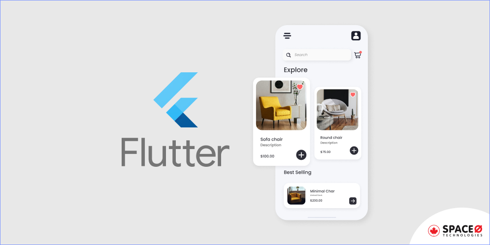
**Flutter Card** is the built-in feature that helps mobile app developers to create beautiful UI. This widget is derived from Google’s Material Design Library. A Flutter Card is a panel of white space with rounded curves and slight elevation from the lower side of the app screen.
The Flutter Card widget comes with some properties like elevation, margin, width, and so on. That allows developers to customize according to their needs. Generally, developers use Flutter Cards to decorate list items using text, images, icons, and buttons.
Here are examples of the Flutter Card. Check the following images to know what a Flutter Card looks like.
Source: Flutter.dev
When a Flutter Card is designed with an image and text, it looks like this on a mobile app screen. Even developers are allowed to set the height, width and margin of the Card to make it look attractive.
Why Do You Need a Flutter Card in Your Project?
The use of a Flutter Card in a mobile app screen improves the look and feel of the user interface. As the Flutter Card enhances the UI of the mobile apps, it attracts the users and makes it easy to differentiate the two components on the screen.
In fact, if you are looking for a leading [Flutter mobile app development company in Canada](https://www.spaceo.ca/mobile-app/flutter/), we have experience in developing more than 300 custom mobile and web apps. Apart from that, we have a dedicated team of Flutter mobile app developers. Check one of our developed solutions with Flutter – an on-demand ride-sharing app.
Looking to Hire Flutter App Developers in Toronto, Canada?
Being a leading mobile app development company in Canada, we help you from ideation to launch your mobile app successfully.

## What are the Flutter Card Properties?
When you code to create a Flutter Card, you might be looking for customization. For that, the Flutter Card properties help developers achieve customization.
| **Name of Property** | **Functioning** |
|---|---|
| borderOnForeground | This property takes the boolean value to make the decision whether to print border on the edges of the Card or not. |
| child | This property takes the value as an object and shows the nested widgets inside the Card widget. |
| color | This property allows you to add or change background color in the colorClass as the object. |
| elevation | This property takes two or double values as the object value. Elevation property allows developers to control the shadow side of the card. The bigger the elevation value, the bigger the shadow distance. |
| margin | This property allows customizing the outer space of the widget. |
| shape | This property helps to customize the shape of the Card widget. |
| shadowColor | This property takes color Class as an object value to decide the color of the shadow. By default, the shadow color of the Card is black. |
| semanticContainer | This property takes a value as a boolean. Allows controlling whether to show child widgets as a single widget or not. |
| Height and width properties | This property allows for adjusting the height and width of the Card as per the requirements. |
Knowing the properties of the Flutter Card is important as it allows you to make your Flutter Card customized as per your requirements. Now, let’s check the process of creating a Flutter Card in mobile app development.
## How to Create a Flutter Card
Creating a Flutter Card is simple. Let’s understand the process step-by-step.
Step 1: You need to create a new project by running the following code in your command prompt.
```
flutter create card_widget
```
With the above command, you will get all the files, folders and the rest of everything needed to start a new Flutter project. Creating a Flutter Card widget doesn’t require adding properties but to show the widget Card, you need to provide child property.
Step 2: Create a file ‘NewApp.dart’ under the lib folder of your Flutter project. In that, you need to import a package of Flutter named ‘material.dart’ in the main file of your project.
Step 3: Then, create a class with the name ‘MyApp’ that extends the Stateless widget class. It looks like this (Class MyApp Extends StatelessWidget).
Step 4: Return MaterialApp under the ‘MyApp’ file, create a scaffold widget as its child and add a text “Hello All”. This MaterialApp gives us access to various properties and components in the material design. Further, in your ‘main.dart’ file, remove all the code except the runApp method. Replace all that ‘Main.dart’ file code with the below code.
```
void main() => runApp(MyApp());
```
This method opens the MyApp widget when your app runs.
The code in the ‘NewApp.dart’ file will look like this in the following section.
```
import ‘package:flutter/material.dart’;
class MyApp extends StatelessWidget {
@override Widget build(BuildContext context) {
return MaterialApp(
home: Scaffold(
body: Text(‘Hello All’),
),
);
}
}
```
Step 5: Create a Card layout structure. Add a container widget within the body.
Step 6: Use the different properties padding, height, width, and child widget to set the Card properly on the screen.
Step 7: Replace the code of Scaffold with the following code.
```
Scaffold(
appBar: AppBar(title: const Text(_title)),
body: const MyStatelessWidget(),
),
);
}
}
```
Now, in the above code, you can see the const function with the name ‘MyStatelessWidget’ method.
Step 8: Call the method MyStatelessWidget, which will have the code of the Card class that displays song name, name of song artist, and two buttons (Buy Tickets and Listen).
```
class MyStatelessWidget extends StatelessWidget {
const MyStatelessWidget({Key? key}) : super(key: key);
@override Widget build(BuildContext context) {
return Center(
child: Card(
child: Column(
mainAxisSize: MainAxisSize.min,
children: [
const ListTile(
leading: Icon(Icons.album),
title: Text('The Enchanted Nightingale'),
subtitle: Text('Music by Julie Gable. Lyrics by Sidney Stein.'),
),
Row(
mainAxisAlignment: MainAxisAlignment.end,
children: [
TextButton(
child: const Text('BUY TICKETS'),
onPressed: () {/* ... */},
),
const SizedBox(width: 8),
TextButton(
child: const Text('LISTEN'),
onPressed: () {/* ... */},
),
const SizedBox(width: 8),
],
),
],
),
),
);
}
}
```
Source: Flutter.dev
Step 9: Add the above code in the NewApp file of your dart app. The result of the code would be like this.
Source: Flutter.dev
You have completed the creation of the Flutter Card. Do you wonder which apps use Flutter Card and how they customize it? Read on the following section.
## 3 Flutter Card Examples
1.
### Google Pay
Source: Google Pay
Google Pay is great in UX/UI. The user interface of Google Pay is beautiful and attractive because it is built using Flutter SDK. In addition, app designers have used different widgets to create this amazing look of the app. One such widget class is Card. In the above image, we have highlighted the widget Card which includes text, icons and color with rounded corners.
2.
### 4 Pics 1 Word
Source: 4 Pics 1 Word
4 Pics 1 Word is a brainstorming game app. With the attractive user interface, Lotum, a mobile app company adopted Flutter to make its app better and to maintain a single app instead of two different applications. In the above image, you would have an app screen that has four different images, and these images are placed using Card. This way, Flutter Cards can be placed in different mobile apps according to your needs to make your app’s UI look better.
3.
### Patch Me: Eye Patch Tracking
Source: Patch Me
The Patch Me app is for parents to track eye patching time for their children. To display the time patching daily, developers give information with day-wise separation on the screen. To improve the basic layout of data, developers used a Card as a better option and added some icons with a text widget under the parent widget.
Looking for a Flutter Mobile App Development?
We are a leading Flutter mobile app development company in Toronto, Canada. We have experience in developing apps for multiple industries; we help you develop a bug-free app. Book a free consultation with our IT professionals.
Check the following section. We have answered some of the frequently asked questions on the Flutter widget.
## FAQ About Flutter Card Widget
**What is the column widget in Flutter?**
The column widget in the flutter is essential that allows you to align the children components horizontally and vertically as per the requirements. When you are designing a UI in the flutter, you need to arrange its content horizontally and vertically to get a proper look. Thus, a column widget is required in the Flutter widgets.
**What is the shape property and how to change it?**
In Flutter, shape property allows developers to modify the shape of the Card widget according to the requirements. You can change the border radius of your Card and apply the radius to it.
**What does it mean by double elevation?**
In Flutter Card, elevation property takes double values to decide the z-coordinate of your placed card on the app screen. That is known as the double elevation.
## Ending-note on Flutter Card Widget
In this article, you have learned about the Flutter Card, its properties, how to create cards in an app, and examples of card widgets. The ultimate benefit of using the Flutter Card is that it helps mobile app developers to arrange components of UI for mobile apps, desktops, and embedded systems to look better.
Want to create an appealing interface for your mobile app? Or looking for Flutter mobile app developers in Canada? Hire our dedicated Flutter app developers who have experience in developing custom mobile app solutions.
---
_View the original post at: [https://www.spaceo.ca/mobile-app/flutter/card-widget/](https://www.spaceo.ca/mobile-app/flutter/card-widget/)_
_Served as markdown by [Third Audience](https://github.com/third-audience) v3.6.1_
_Generated: 2026-06-30 04:13:52 UTC_